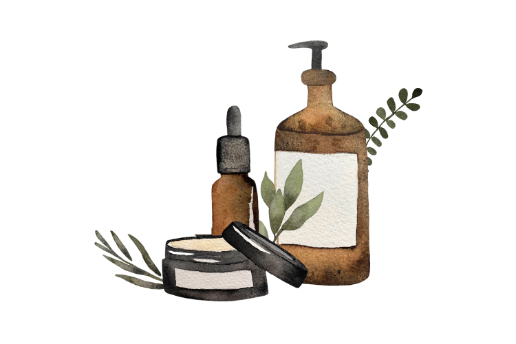
Design Ideas That Make Your Fragrance Brand Look Expensive Before the First Spray
There’s something wildly satisfying about seeing your fragrance label come to life for the first time.
The bottle is sitting there. The cap is perfect. The scent smells expensive. Then comes the label.
And suddenly? Panic.
What font do you use? How big should the label be? Should it be minimal? Moody? Vintage? Colorful? What actually looks luxury without costing a fortune?
Here’s the good news.
You do not need a giant design agency or a $20,000 branding package to create perfume packaging that feels elevated, intentional, and retail-ready.
Some of the best-selling indie fragrance brands started with Canva, a textured label, and a really clear point of view.
In fact, packaging influences purchasing decisions for roughly 72% of consumers. That means your label is often selling the fragrance before anyone even smells it.
Your label is not just decoration. It’s positioning.
A clean label can make a fragrance feel modern. A serif font can instantly feel editorial. A cream textured label with black ink? Quiet luxury all day.
And the best part? Small details make a huge difference.
If you’re building a fragrance line, launching a signature scent, creating wedding favors, opening a boutique brand, or testing the waters with private label perfume, this guide will help you create labels that actually look polished and cohesive.
Let’s talk inspiration.
Why Label Design Matters More Than You Think
Fragrance is emotional.
People buy perfume because they want to feel something.
Confident. Romantic. Expensive. Mysterious. Nostalgic. Main character energy.
Your label is the first hint of that story.
Before someone smells the perfume, they’re already making assumptions based on:
• Font choices
• Label texture
• Bottle shape
• Color palette
• White space
• Placement
• Finish choices
• Brand name styling
The label sets expectations for the scent experience.
A sleek monochromatic label suggests modern luxury. A handwritten script feels artisanal and romantic. Bold typography can feel fashion-forward or niche.
This is why packaging matters so much in fragrance.
You’re not just selling a scent.
You’re selling a feeling.
The Most Popular Private Label Perfume Label Styles Right Now
Trends shift constantly, but these are the label aesthetics we’re seeing dominate indie fragrance brands right now.
Quiet Luxury
Minimal. Cream labels. Black serif fonts. Tiny details.
Think:
• Lots of breathing room
• Soft ivory or linen textures
• Lowercase typography
• Understated elegance
• Small centered layouts
This style works beautifully for:
• Elevated boutique brands
• Spa-inspired collections
• Gender-neutral fragrances
• High-end minimalist aesthetics
Simple almost always looks more expensive.
One mistake newer brands make? Trying to fit too much information on the front label.
Luxury brands edit aggressively.
Apothecary Labels
This aesthetic is having a major moment, thanks to the clean girl aesthetic.
Vintage botanical illustrations. Old world typography. Black and cream labels. Slightly mysterious vibes.
Perfect for:
• Witchy brands
• Dark academia aesthetics
• Botanical collections
• Seasonal launches
• Ritual-inspired fragrances
Think antique perfume counter meets modern indie perfumery.
We’re seeing a lot of clients lean into:
• Moon imagery
• Herb sketches
• Celestial symbols
• Vintage-style borders
• Layered typography
It photographs beautifully on social media.
Modern Color Blocking
For brands that want to feel youthful, fun, or editorial.
This style uses bold color palettes, oversized typography, and graphic layouts.
Examples include:
• Soft peach + burgundy
• Chocolate brown + cream
• Olive + ivory
• Bright citrus tones
• Matte black + neon accents
Color instantly changes the personality of a fragrance line.
Warm neutrals feel grounded and expensive.
Bright tones feel playful.
Black & white feels niche.
Muted earthy tones feel artisanal.
Handwritten + Personal
This aesthetic works especially well for:
• Bridal fragrances
• Small batch artisan brands
• Creator brands
• Giftable collections
A handwritten font paired with clean typography can feel intimate and elevated.
The trick is balance.
Too many scripts can quickly look hard to read or overly busy.
A good rule?
Use one statement font and one supporting font.
That’s it.
The Biggest Mistakes We See With Perfume Labels
Let’s save you some time.
These are the most common label design mistakes newer fragrance brands make.
Labels That Are Too Small
Tiny text might look cute on screen.
In real life? Nobody can read it.
Always test-print your label before ordering production.
Tape it onto a bottle.
Look at it from a shelf distance.
Can you still read it clearly?
If not, increase the font size.
Overcrowding the Design
You do not need:
• Your entire mission statement
• Every social media handle
• Ingredient essays
• Multiple logos
• Five fonts
on the front label.
Whitespace is your friend.
Luxury packaging feels intentional because it isn’t cluttered.
Using Too Many Fonts
This is the fastest way to make packaging feel chaotic.
Stick to:
• One headline font
• One supporting font
Done.
Consistency builds trust.
Ignoring Bottle Shape
Your label should complement the bottle.
A tall narrow bottle needs different proportions than a short square bottle.
This is why mockups and pre-production samples matter.
A design that looks perfect on screen may wrap awkwardly in real life.
How to Make Your Perfume Labels Look More Luxury
Want the secret?
It’s usually restraint.
Not more.
Here are a few easy upgrades that instantly elevate packaging.
Use Fewer Words
Luxury brands don’t overexplain.
Clean labels feel more premium because they feel curated.
Focus on Texture
Textured linen labels instantly feel more tactile and elevated.
Even simple black typography looks expensive on a textured stock.
Choose Better Fonts
Fonts change everything.
A modern serif can make a basic bottle feel editorial.
A clean sans serif can make packaging feel contemporary and unisex.
Some styles trending right now:
• Elegant serif fonts
• Thin modern sans serifs
• Minimal lowercase typography
• Handwritten accents
• Vintage editorial fonts
Keep Placement Intentional
Centered labels almost always feel cleaner.
Alignment matters more than people realize.
Crooked spacing or uneven margins can instantly cheapen the look.
Designing Labels in Canva
Here’s the truth.
A huge percentage of indie fragrance brands use Canva.
And honestly?
You absolutely can create beautiful perfume labels there.
Especially when you start with the right template size.
We recommend:
• Setting exact dimensions first
• Designing at full scale
• Leaving safe margins
• Avoiding super thin fonts
• Printing a test copy before production
Simple designs usually print best.
Very fine lines, tiny details, or low-contrast colors may not translate well onto textured labels.
If you’re new to packaging design, start simpler than you think.
You can always evolve the branding later.
Perfectionist? Get A Pre Production Sample
One of the smartest things you can do before launching a fragrance line?
Order a pre production sample.
Seriously.
Seeing your packaging in real life changes everything.
Photos don’t always tell the full story.
A bottle may feel larger or smaller than expected.
A cap finish might look warmer in person.
A label could need resizing.
A font may appear too delicate once printed.
Samples help you catch issues before committing to a larger run.
They’re also incredibly useful for:
• Product photography
• Investor presentations
• Retail meetings
• Social media teasers
• Website mockups
• Testing shelf presence
• DIY label application practice
We always recommend brands test before scaling.
Questions to Ask Yourself Before Designing Your Label
Before opening Canva, ask yourself:
• What emotion should this fragrance evoke?
• Who is this fragrance for?
• Would this look at home in Sephora, Anthropologie, or a niche perfumery?
• Is my branding timeless or trendy?
• Does the packaging match the scent story?
• Would I stop scrolling for this?
Because ultimately?
Your packaging should feel like an extension of the fragrance itself.
Final Thoughts
Your perfume label does not need to be complicated to be beautiful.
Some of the most memorable fragrance brands use incredibly simple packaging.
A great bottle.
A clean label.
A strong story.
That’s it.
The magic is in the consistency.
If your fonts, colors, mood, and scent all feel aligned, your brand instantly feels more established.
And remember.
You do not need to have everything perfect before launching.
Start where you are.
Refine as you grow.
Some of the most iconic fragrance brands evolved their packaging multiple times before finding their signature look.
The important part is starting.
Because the fragrance sitting in your head right now?
It deserves a bottle.
And a label that makes people want to pick it up.
Takeaway: Keep your packaging simple, intentional, and aligned with your scent story. Small design details create a massive impact in fragrance branding.